Process Poster
Changes:
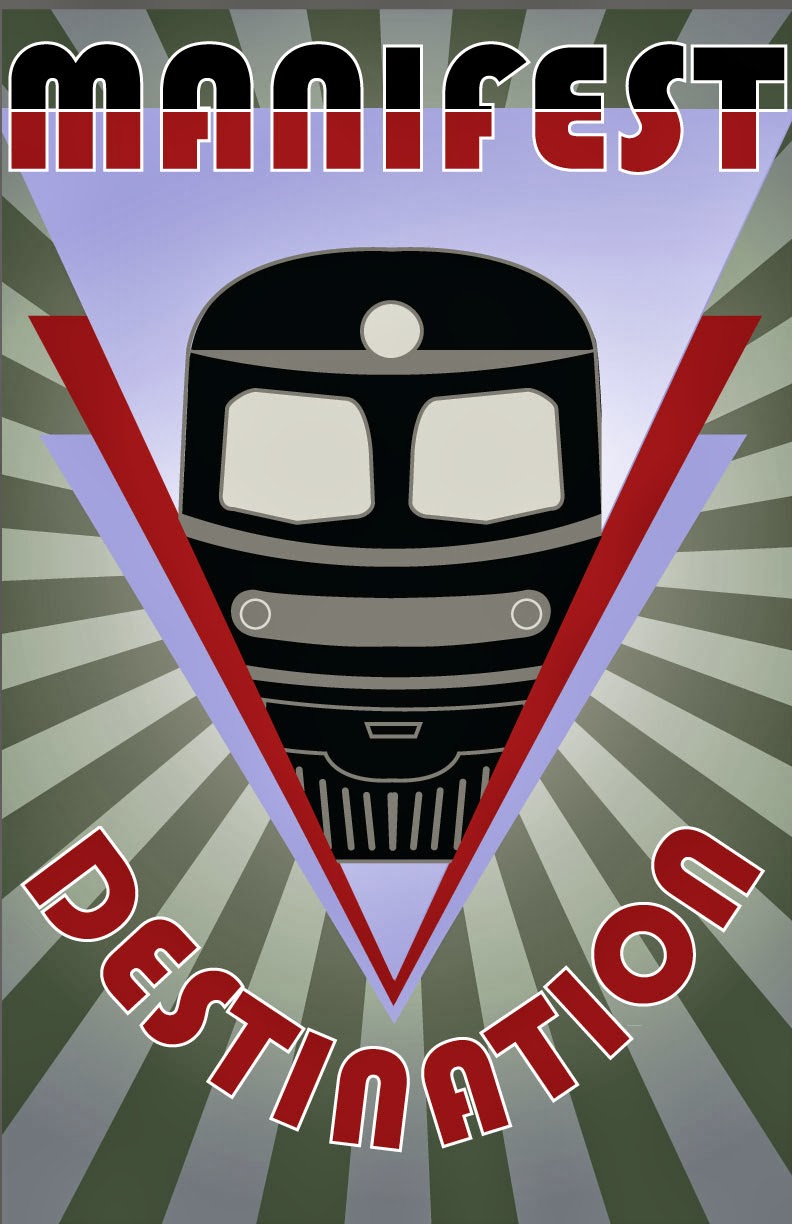
-I centered the design because I feel it makes it more
impactful.
-I added more radial rays to give a better sense of
movement.
-I split the word Manifest black and red and created
interaction with the purple shape. I also added a white stroke to both words to
add visual interest and increase legibility.
-I applied gradients to everything except the train and
words to imply movement.


